Democracy: Doing better, feeling worse
A mash-up of two charts that relate to the reading I’ve been doing lately on the state of democracy. The orange line shows the number of countries that are established democracies according to Polity IV data. The blue line shows how frequently the phrase “crisis of democracy” appears in the English language corpus in Google’s Ngram.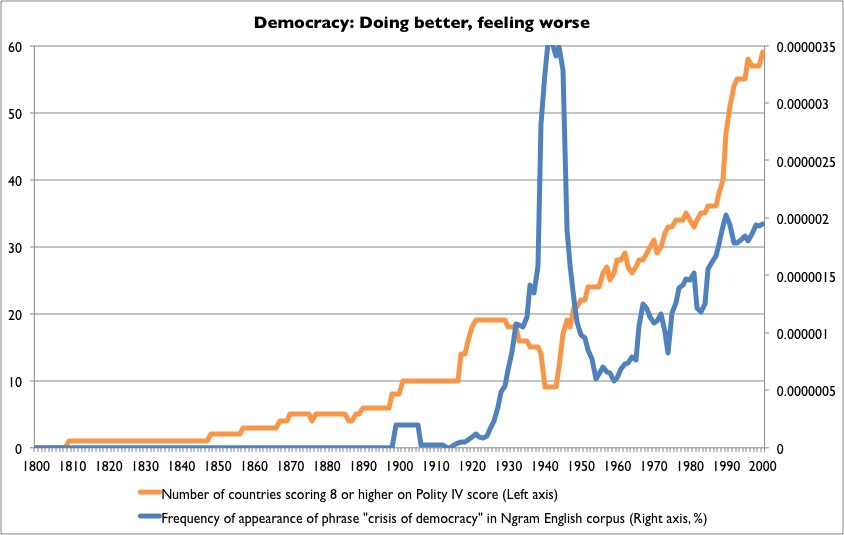


